Type
Public commission
Programme
Exhibition and Graphic Design
Location
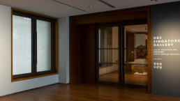
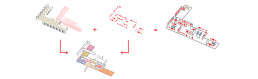
The National Gallery, Singapore
Timeline
09/2013 – 11/2015
Area
7,000 sqm (all galleries)
Partner
Gallagher & Associates Asia
Contractor
Pico Art International pte. ltd.
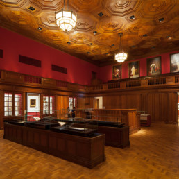
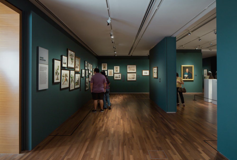
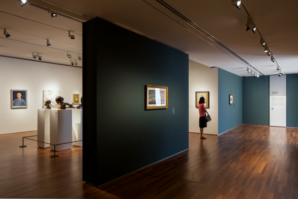
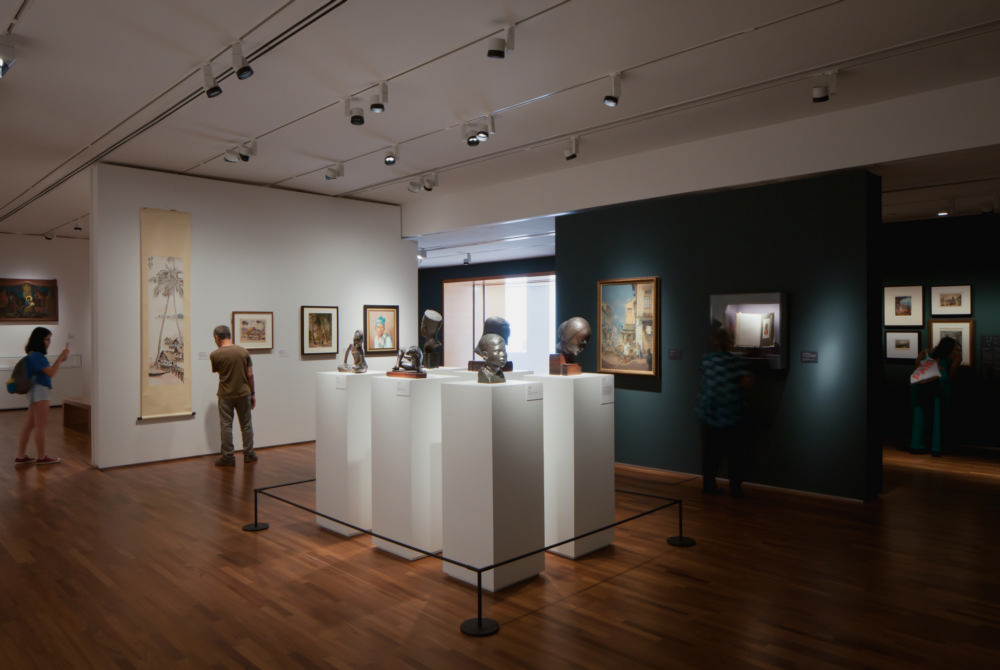
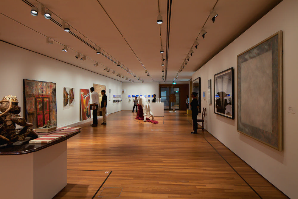
Exhibition design is a symbiosis between the architecture, the narrative, the artworks, and the visitor experience
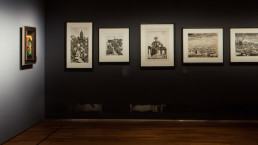
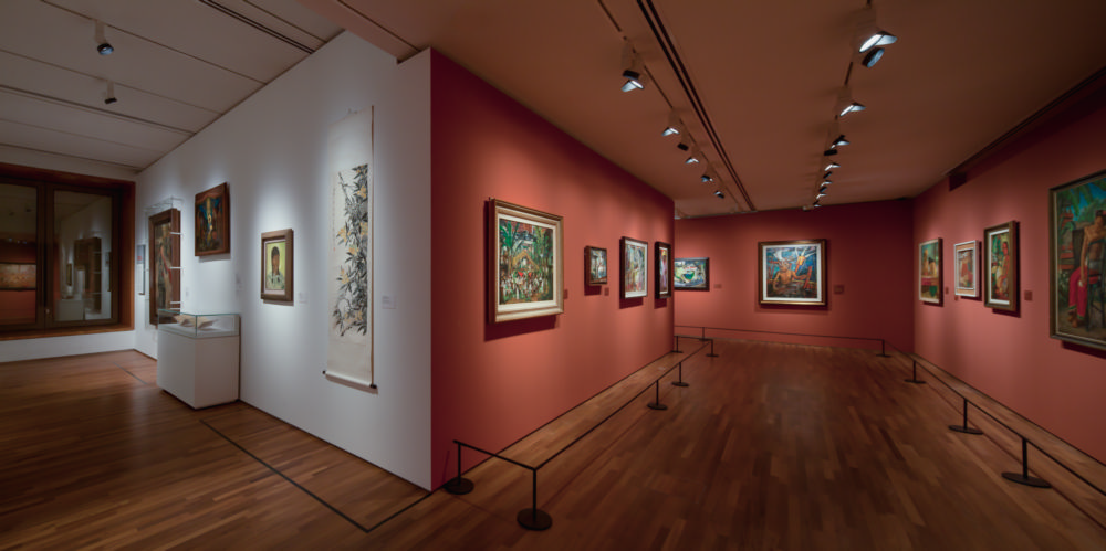
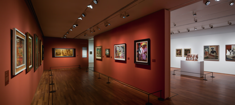
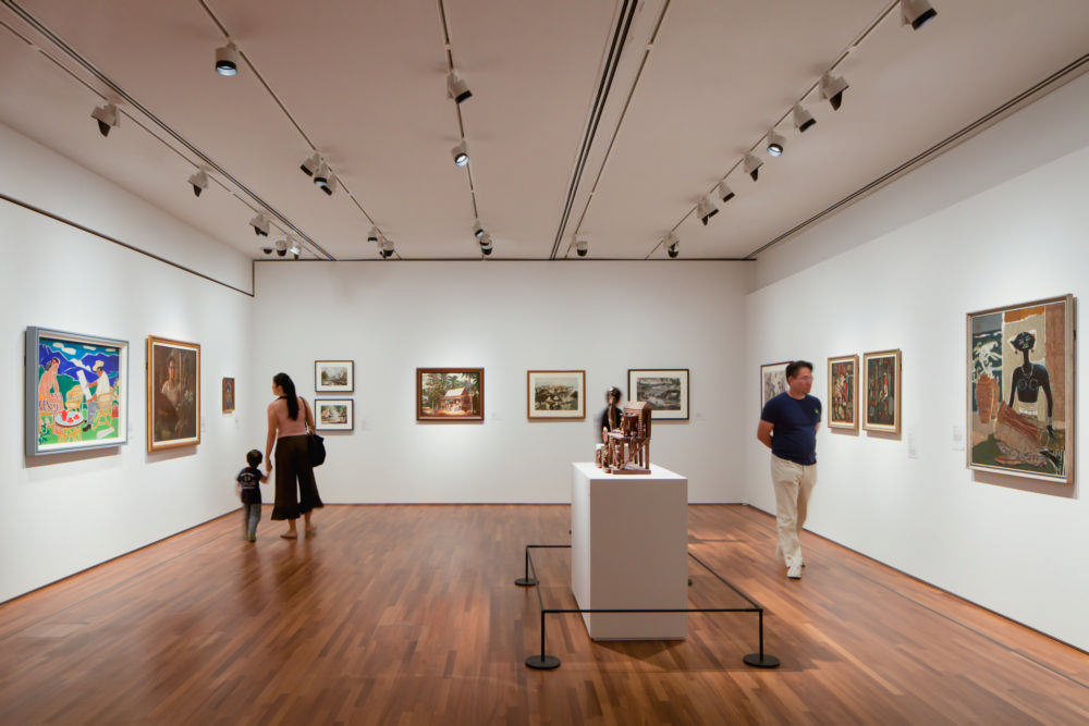
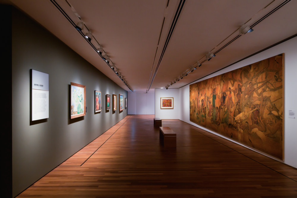
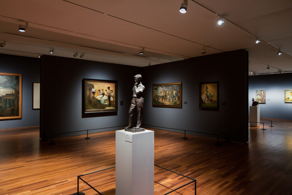
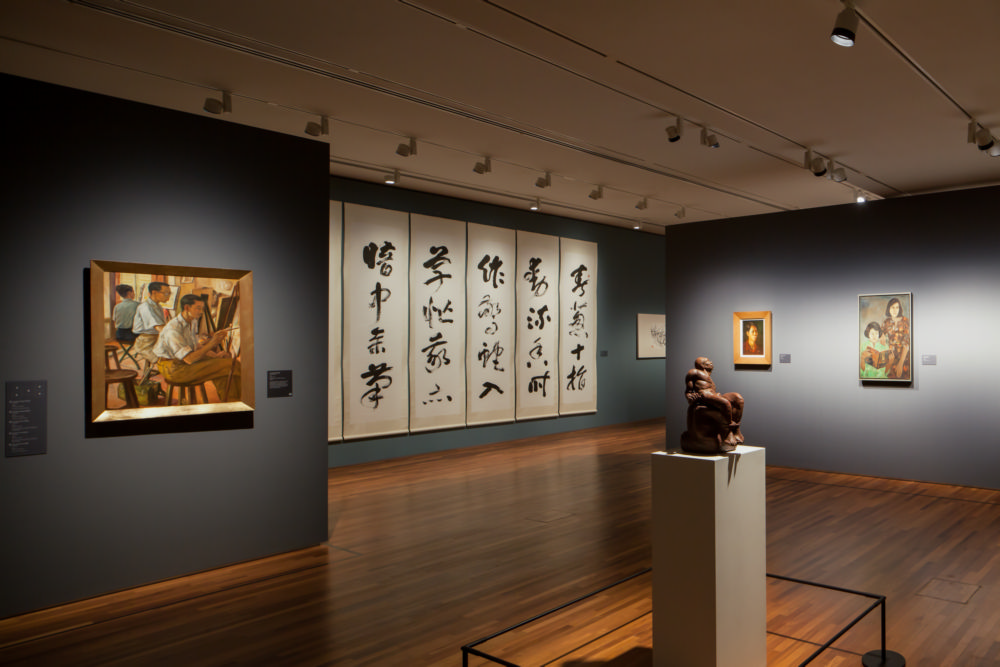
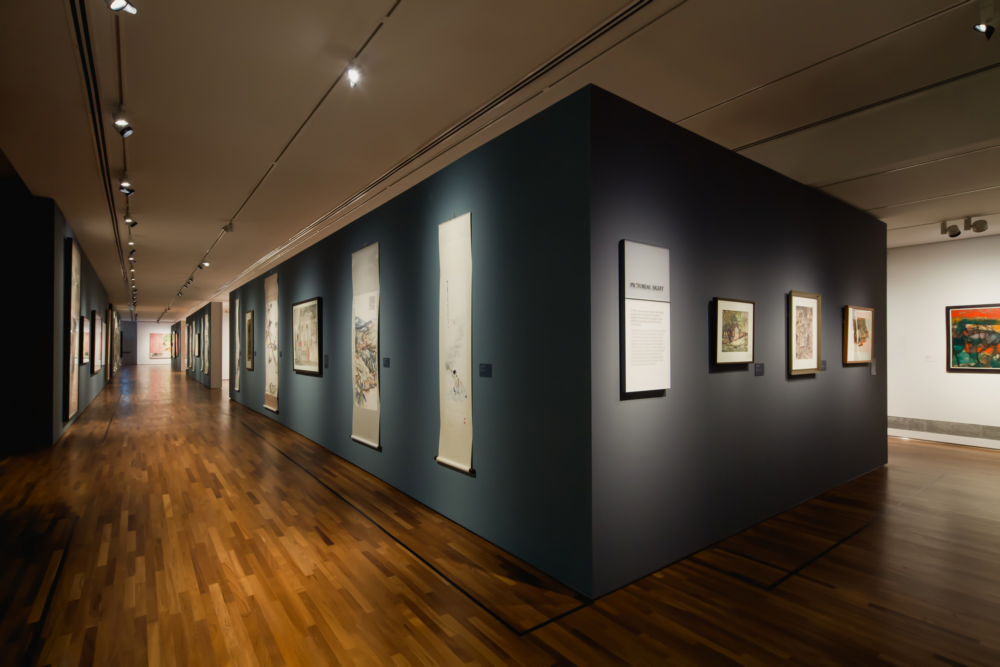
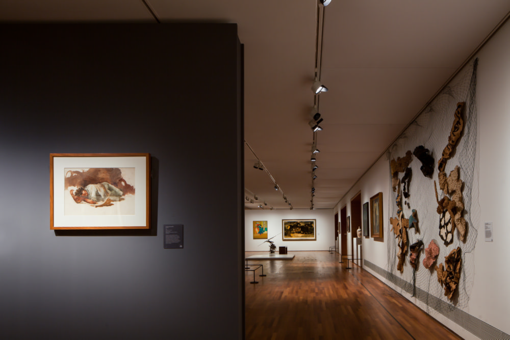
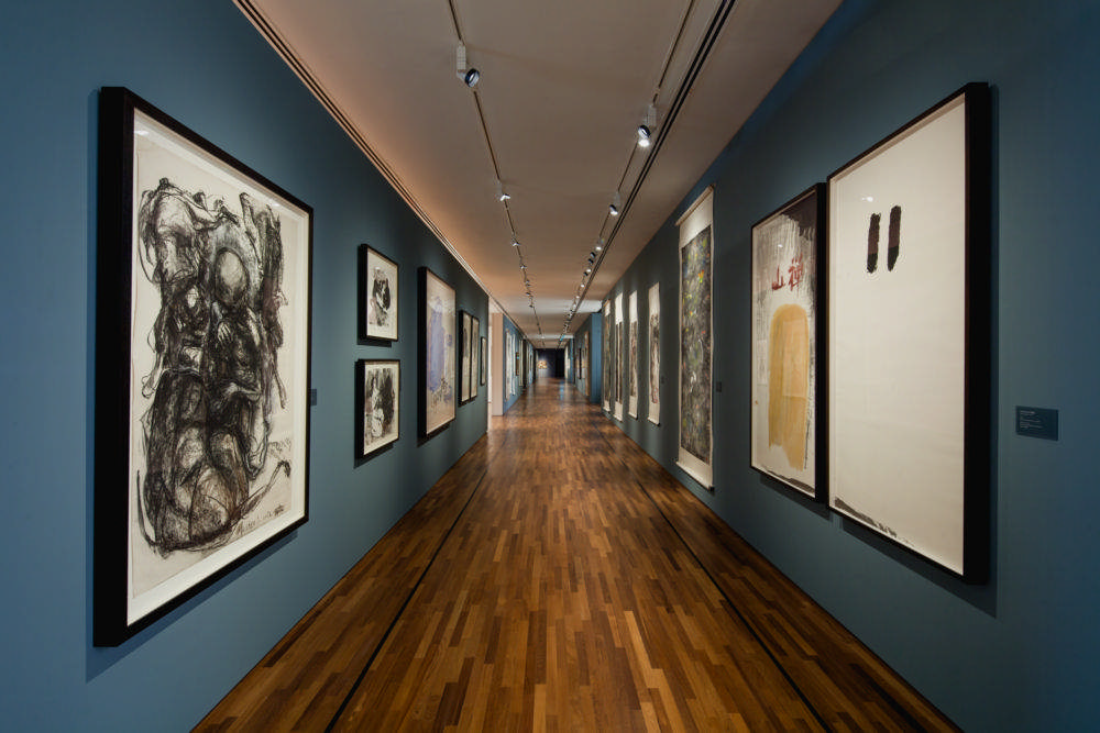
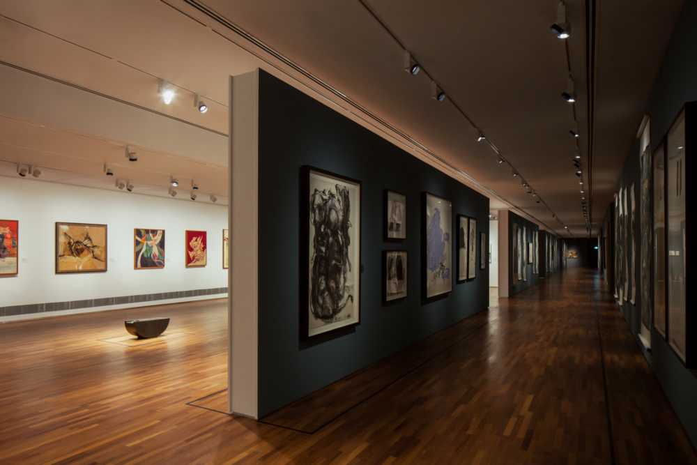
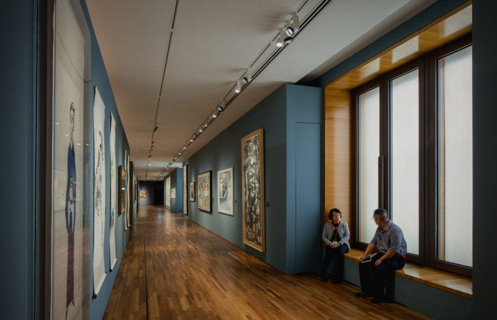
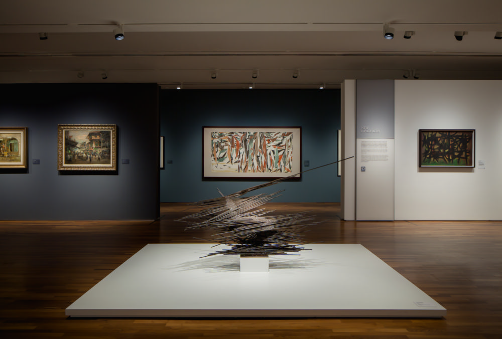
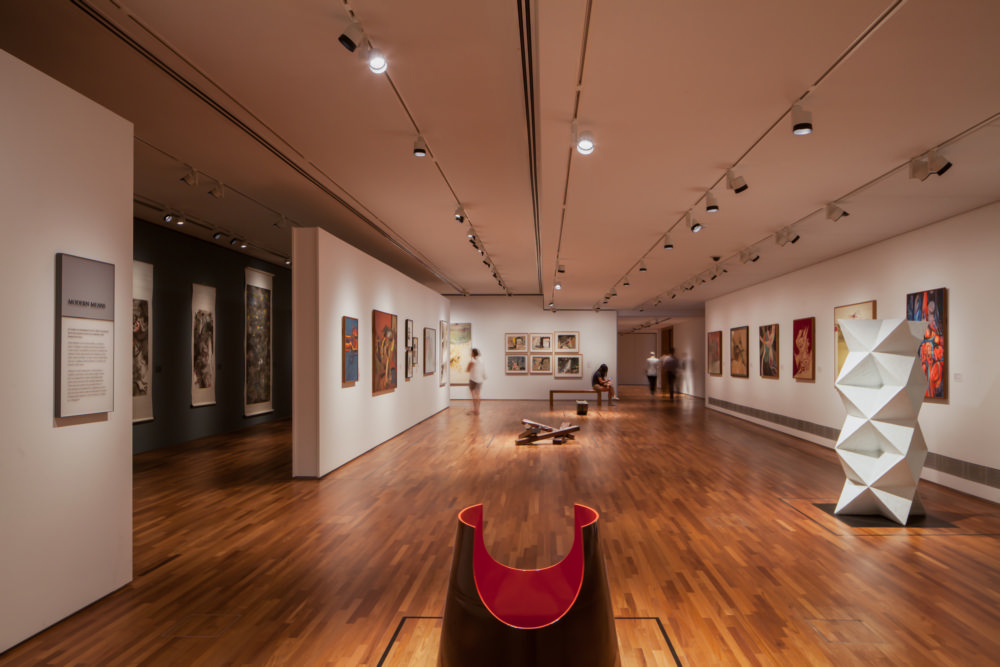
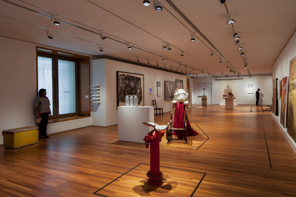
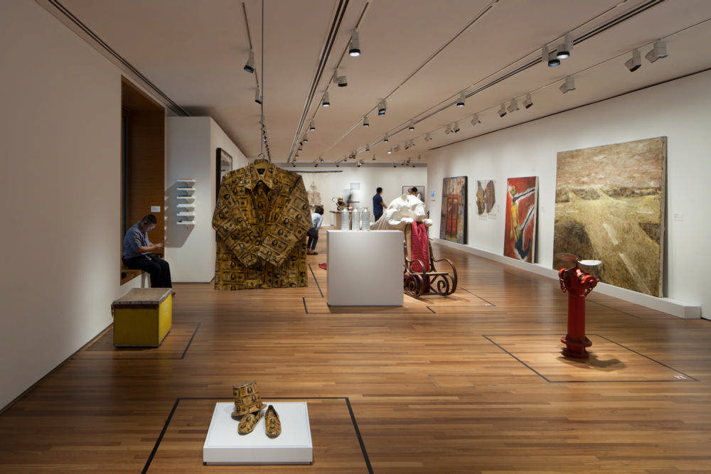
Both grand and salon-style hangs with focused lighting were used for earlier work, and a simpler modern white-box style was used for work dating from the 1960s onwards. Colour was applied to give the galleries distinct identities, and to depict the era of the artwork displayed within. Often, tones were sourced from the artworks themselves. The deep red colour applied to the walls of Gallery 1 gives way to a rich brown in Gallery 2, and to a more traditional wall-hung presentation.
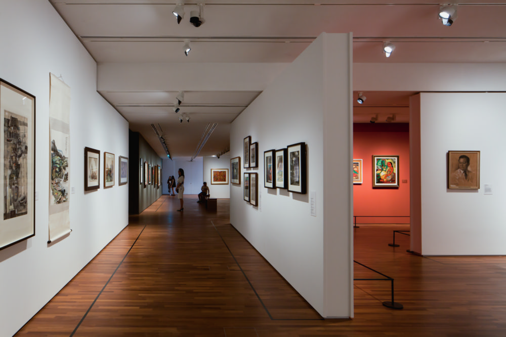
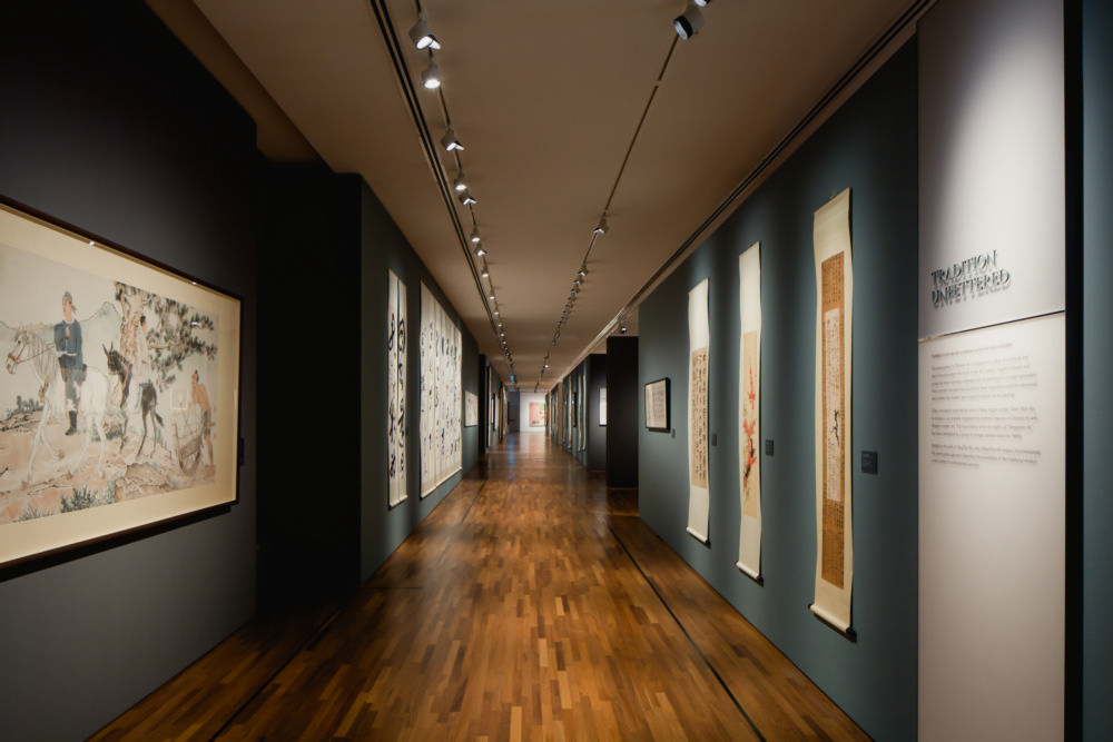
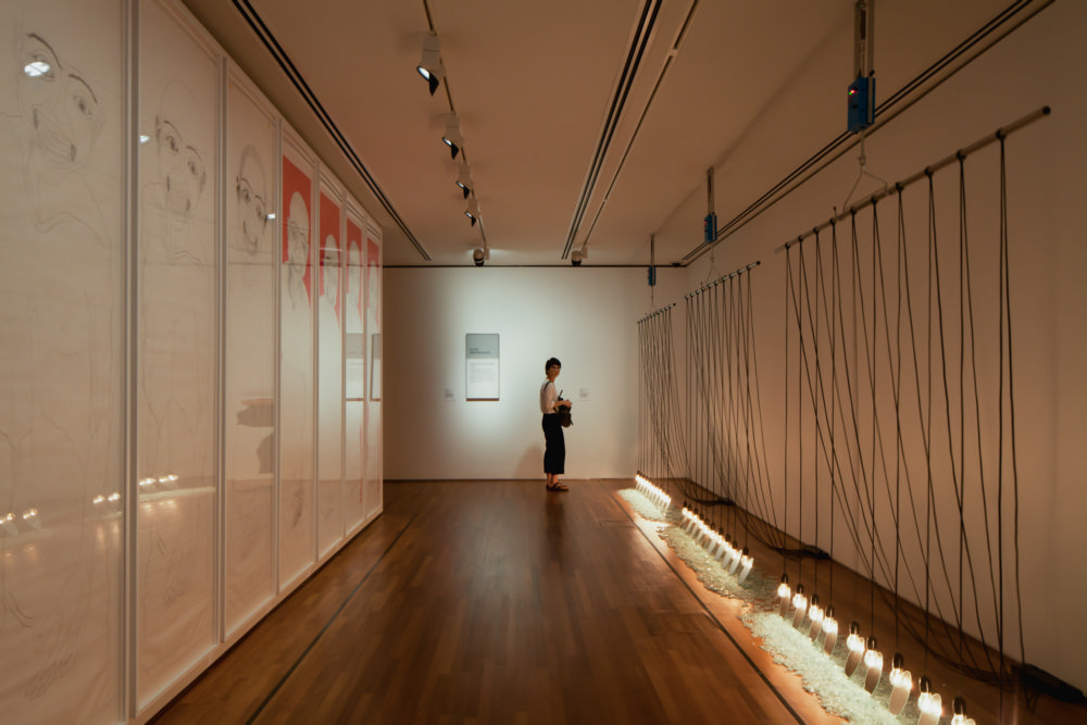
Throughout the various spaces, panels have been added as a new layer of wall on which artworks are hung. They are meticulously consistent in height and can be easily removed to reveal the historical building fabric. Their placement in some areas as partitions establishes long spaces and viewing corridors. The most notable example of this is in the Singapore Gallery, where a large collection of ink paintings has been arranged as a long connecting space. Using ink as a connecting element rather than a ‘section’ in a larger exhibition is something that has never been done before.
Type
Marché Public
Programme
Scénographie & signalétique
Localisation
Galerie Nationale – Singapour
Calendrier
09/2013 – 11/2015
Surface
7,000 m2 de Galeries
Collaborateur
Gallagher & Associates Asia
Réalisation
Pico Art International pte. ltd.
La scénographie est une symbiose entre l’architecture, la narration, les oeuvres et l’expérience du visiteur.
Un système d’accrochage classique et dense de type “salon” avec éclairages directionnels est préféré pour les œuvres les plus anciennes, alors qu’un système de boîtes blanches présente sobrement les œuvres à partir des années 60. Les aplats colorés se déclinent comme des repères temporels et soulignent l’identité de chaque galerie. Souvent, la teinte choisie est extraite des œuvres exposées. Le rouge profond appliqué dans la galerie 1 se densifie en une teinte brune dans la galerie 2 avec un accrochage plus traditionnel.
Tout le long des différents espaces, les œuvres sont accrochées sur des cimaises ajoutées en surépaisseur des murs. Elles correspondent précisément à la hauteur des murs existants et sont facilement amovibles pour révéler les éléments conservés du bâtiment historique. On les retrouve souvent dans les grands espaces de connexion tel qu’au sein de la Galerie de Singapour, où l’imposante collection d’encre de Chine se découvre au fil d’un long espace. Ce processus scénographique innovant est ainsi utilisé pour lier deux espaces d’exposition: l’encre est utilisée comme élément connecteur.


IN DEPTH