Type
Private commission
Location
Jakarta, Indonesia
Area
250 m2
Program
Rebranding
Client
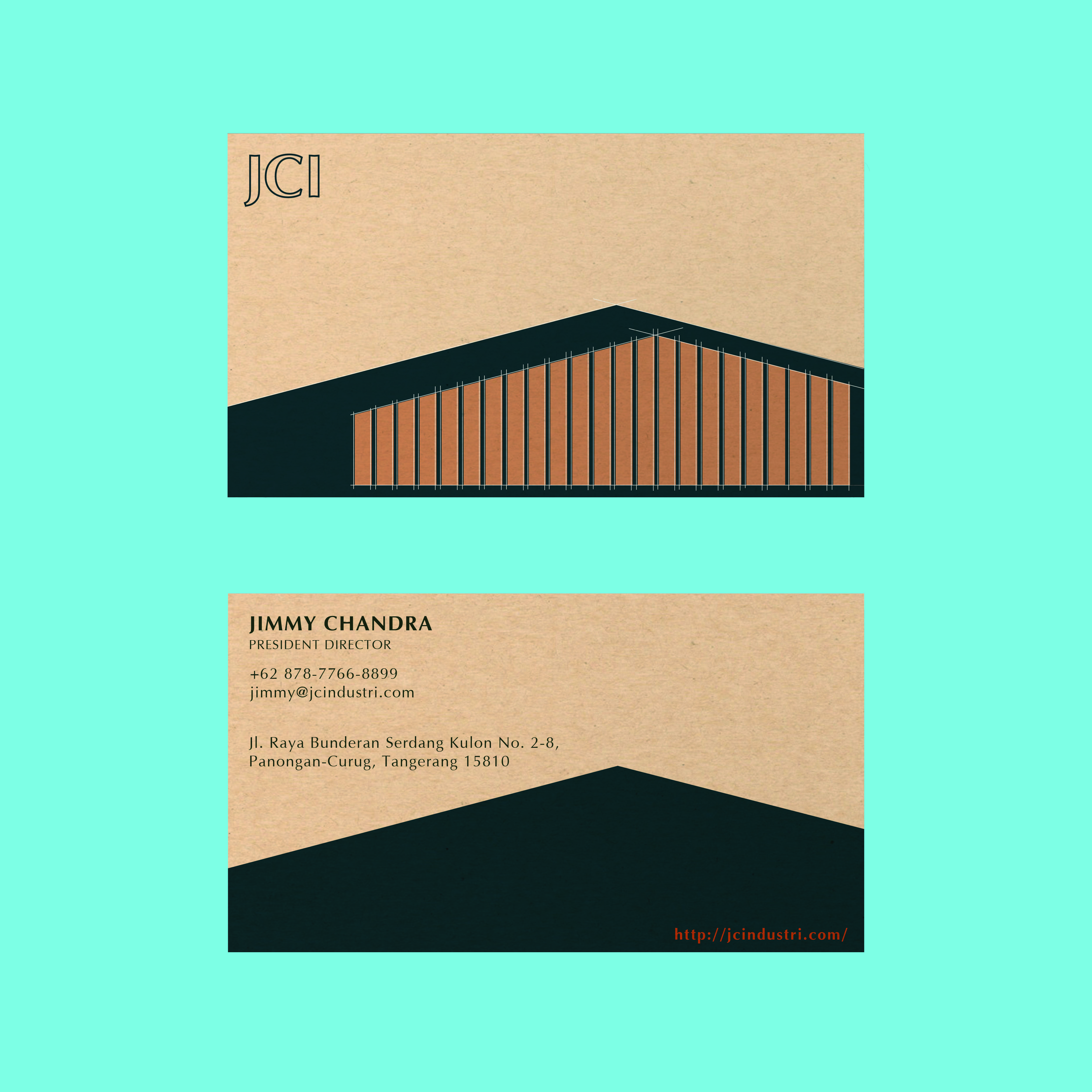
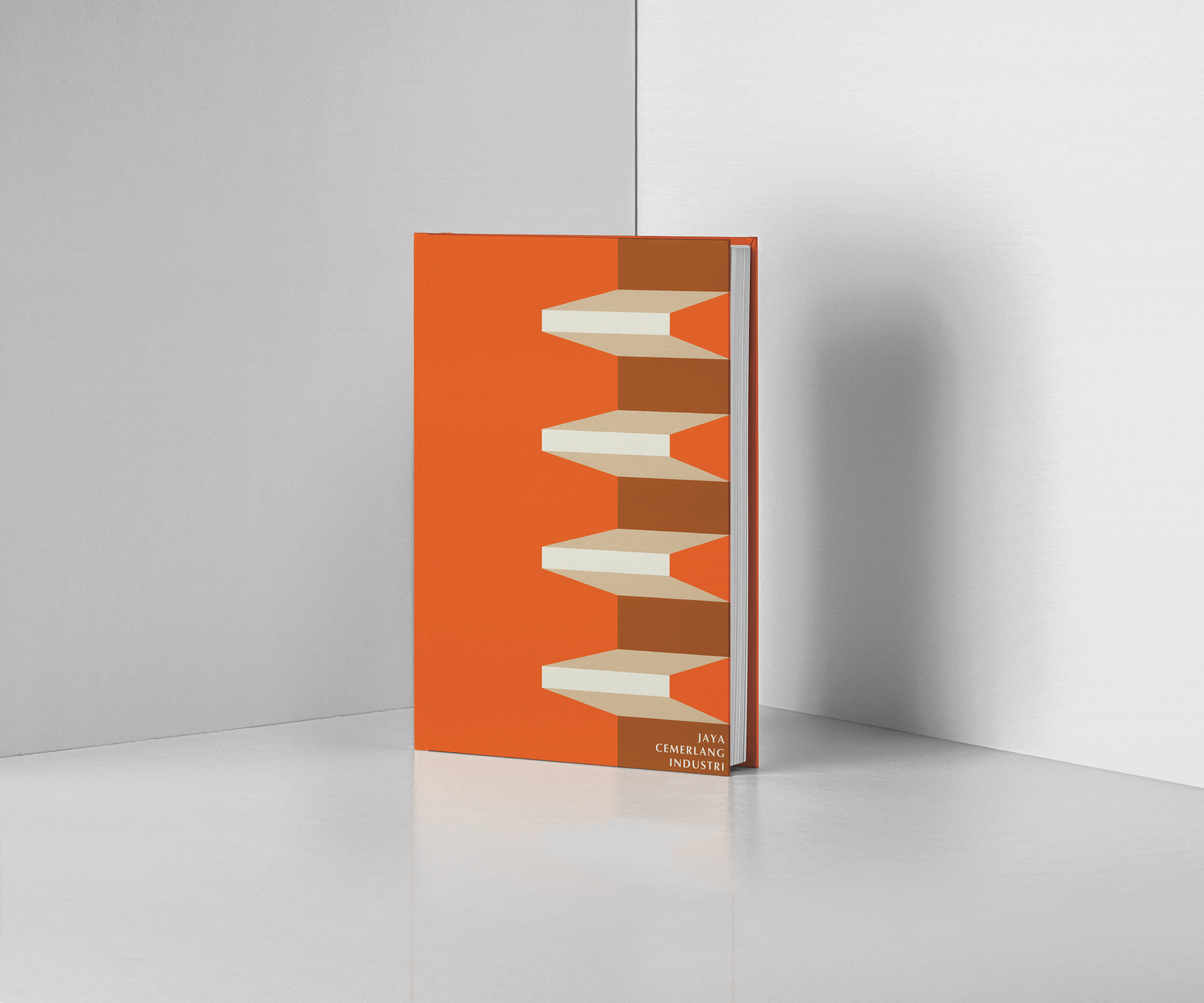
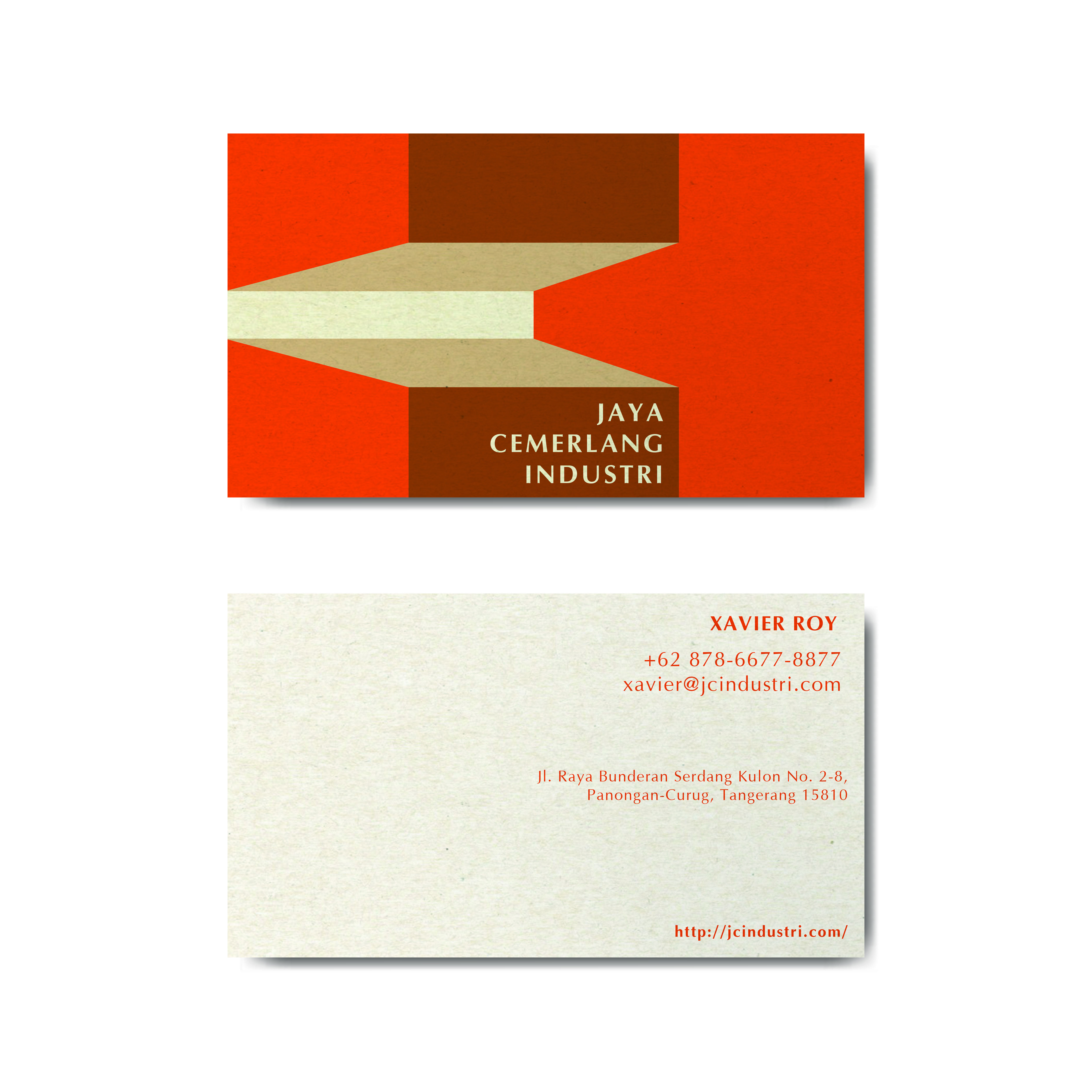
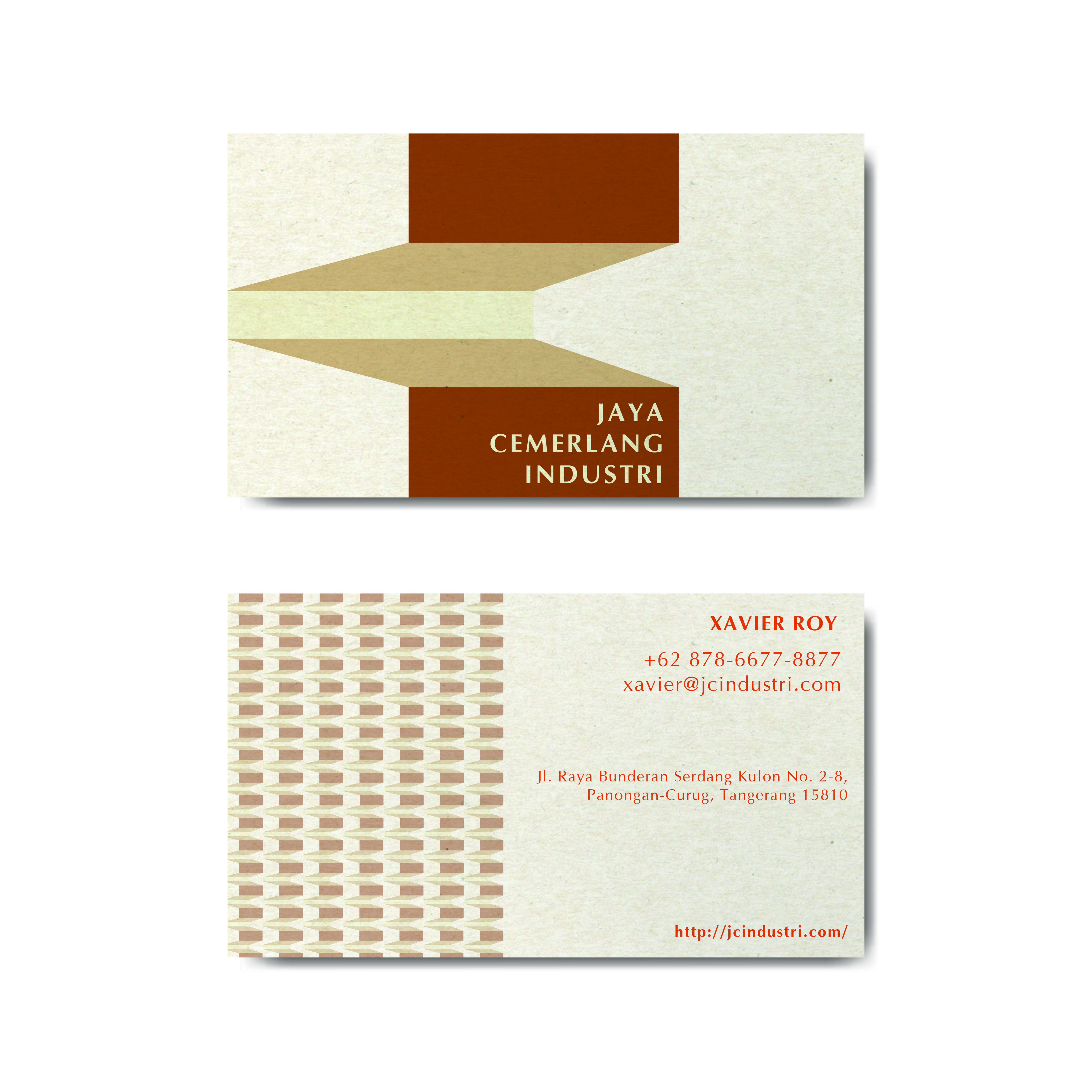
Jaya Cemerlang Industri
Timeline
09/2020 – 12/2020
“An exploration of the possibilities of representing a brand story.”
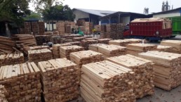
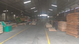
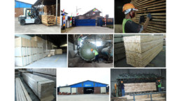
Jaya Cemerlang Industri is an Indonesian Mass Engineered Timber Company with 30 years of history. This exercise called for a brand refresh as the company wants to position themselves in the international architecture market with wood getting more and more popular in the construction industry. While the long legacy of this family business is kept in mind in the design strategy, it was important to give the brand a revitalised direction. The process was done through the in-depth study of the current company’s positioning, market research of benchmarks, industry research in order to solidify a compelling brand story for JCI.
Rounding up the background and capabilities of JCI, we can identify that the emphasis should be given to the honest nature of the company. Being a family business, being down-to-earth is essentially in the company’s DNA. With a family, there is (connotations of) support, involvement and togetherness. This is a unique and advantageous position to be in, compared to large-scale multi-national corporations where a connection can feel impersonal at times. Benefits of this approach can give light to JCI’s ability to authentically build trust and rapport in a sincere and devoted manner. There is also continuity and lineage in a family, just as with how JCI wants foster long-term relationships with their clients, and to build a strong legacy of an inclusive and thoughtful business that is capable of standing firm through time.
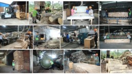
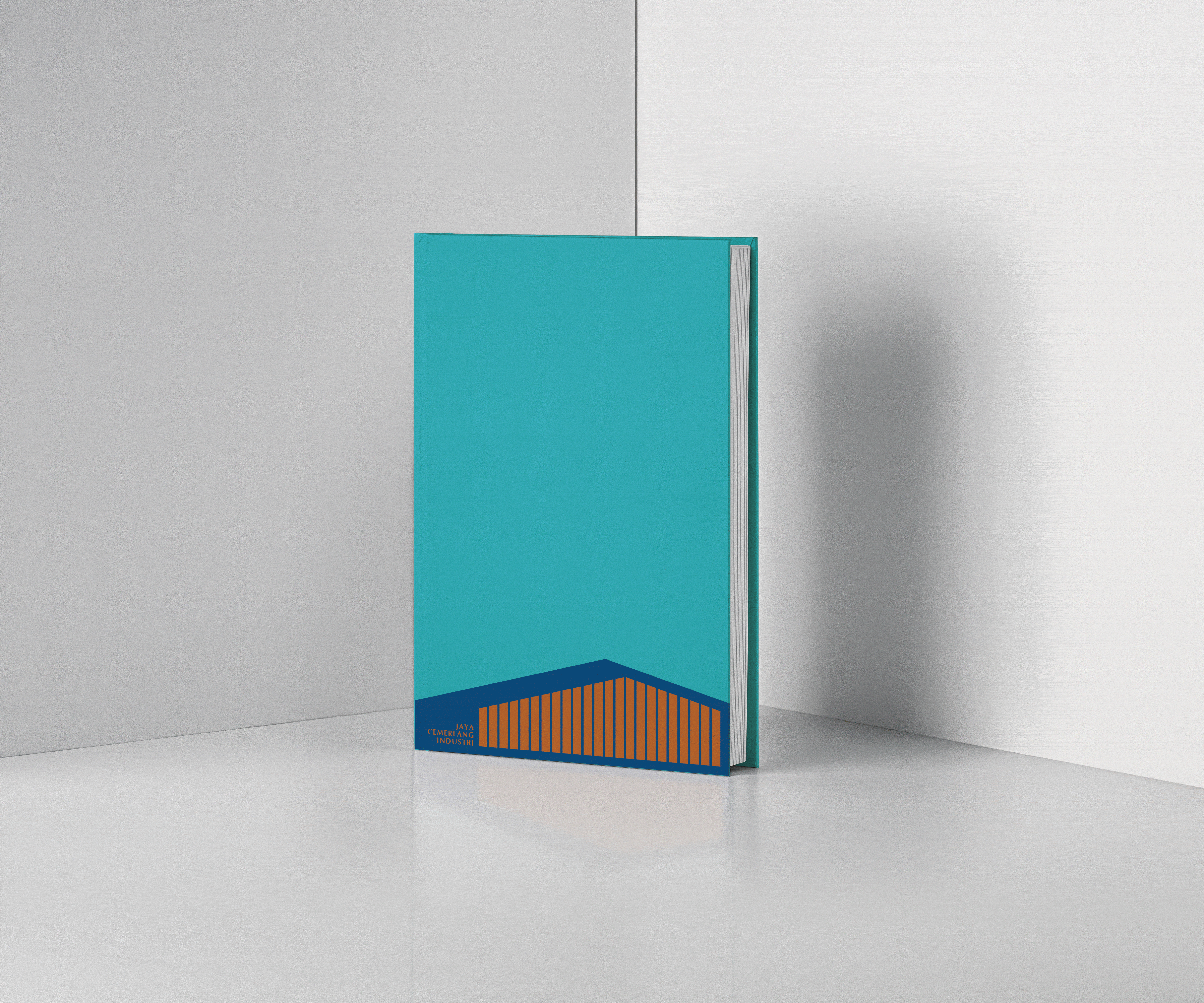
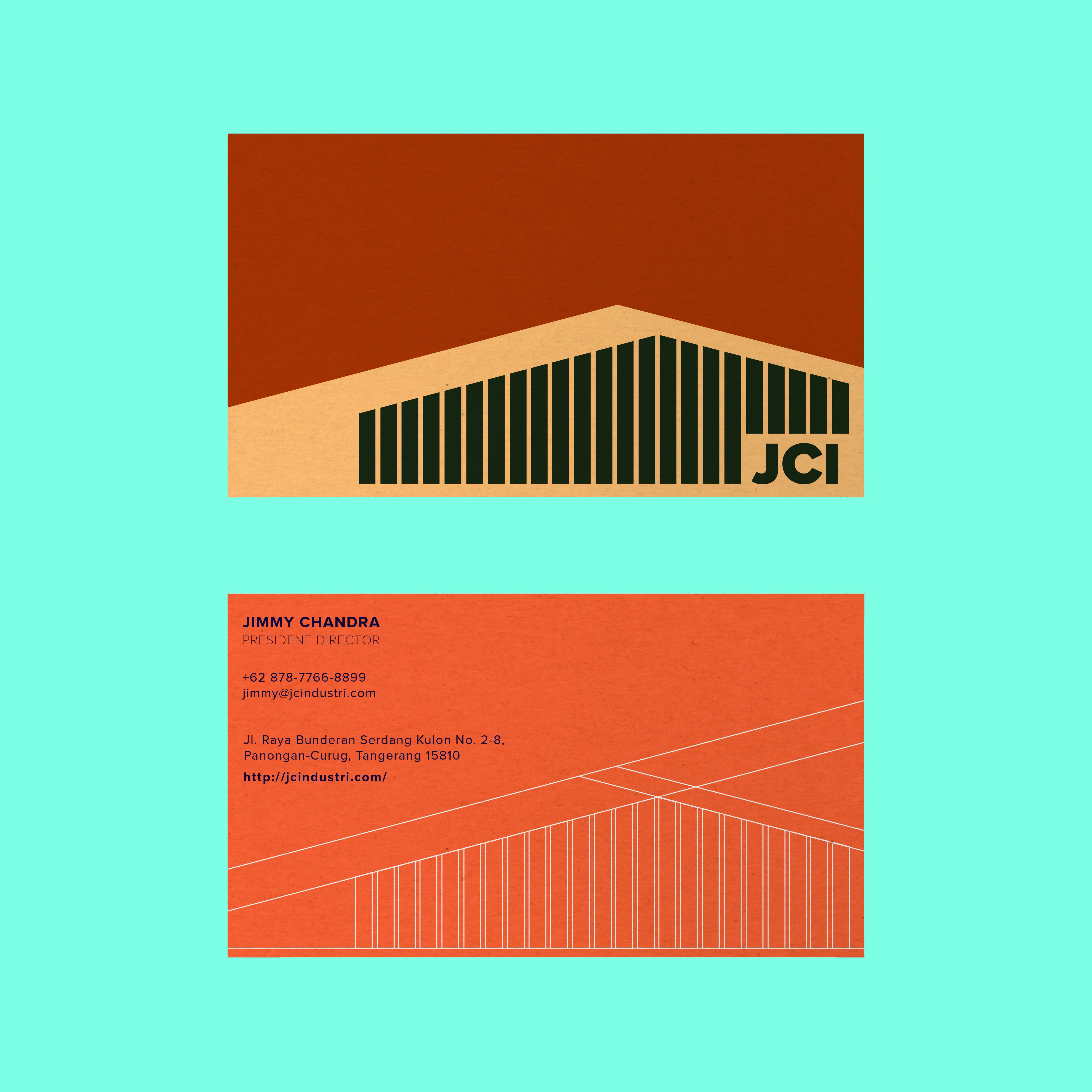
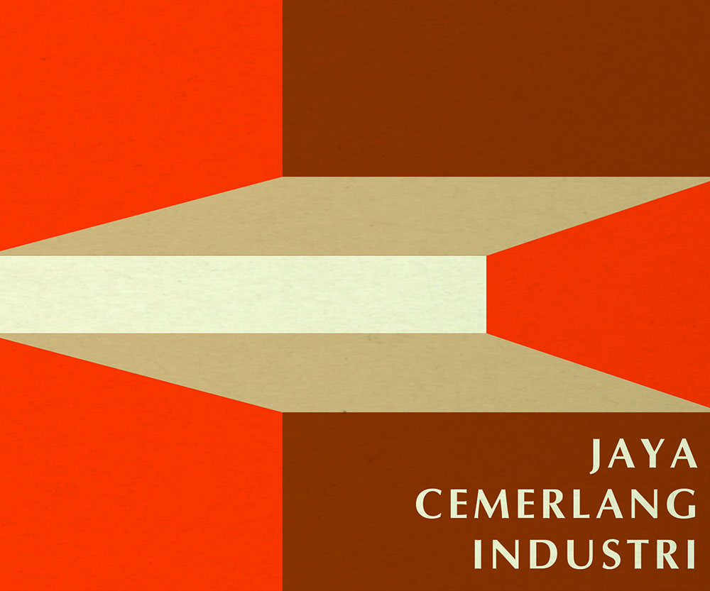
1. The “house” (factory) illustrates the family-owned business, the company ensures its continuity and position in the industry by doing everything under one roof, from being involved in communicating with clients and quality control. What makes the “house” solid and stable is the materials and the pool of people with experience and expertise, producing high-quality products. The house is modest and humble, it is inclusive and welcome everyone and every project, big or small.
2. Finger joint is a good visual inspiration for the action and involvement oriented quality of the company. The joint lumber resembles interlocking hands, which can be used to strongly illustrate a partnership between the company and their collaborators. A joint, in and of itself means belonging to or shared between two or more people and a place where two things are fastened together. Which can be used to represent the idea of interconnectedness, support and the strong bonds as a result of it.
3. Balsa wood is one of the strongest, lightest and most versatile wood in the industry. It comes in a variety of shape and sizes for all types of projects, big, small and everything in between. This makes balsa wood/tree anatomy an apt visual inspiration to depict the agile, inclusive and easy-to-work-with nature of the company. Balsa wood is light because of its cells are big and the walls are thin, hence the ratio of solid matter to open space is minimal. This aspect can be used to draw parallels to the company’s openness and capacity to experiment and work out creative possibilities with their collaborators. It also presents a straightforward and dimensionally stable, adding to the practical and non-pretentious nature of the brand.
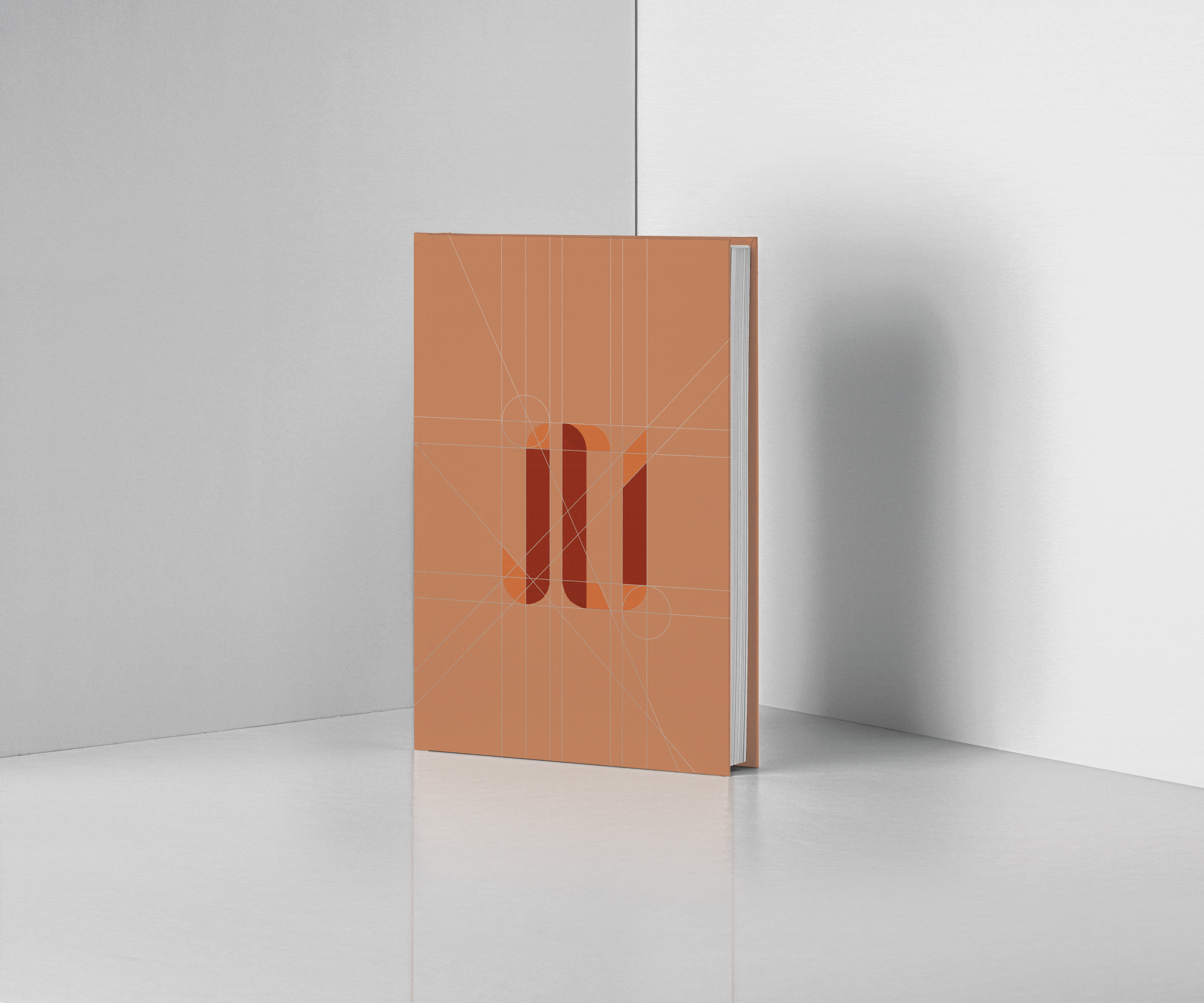
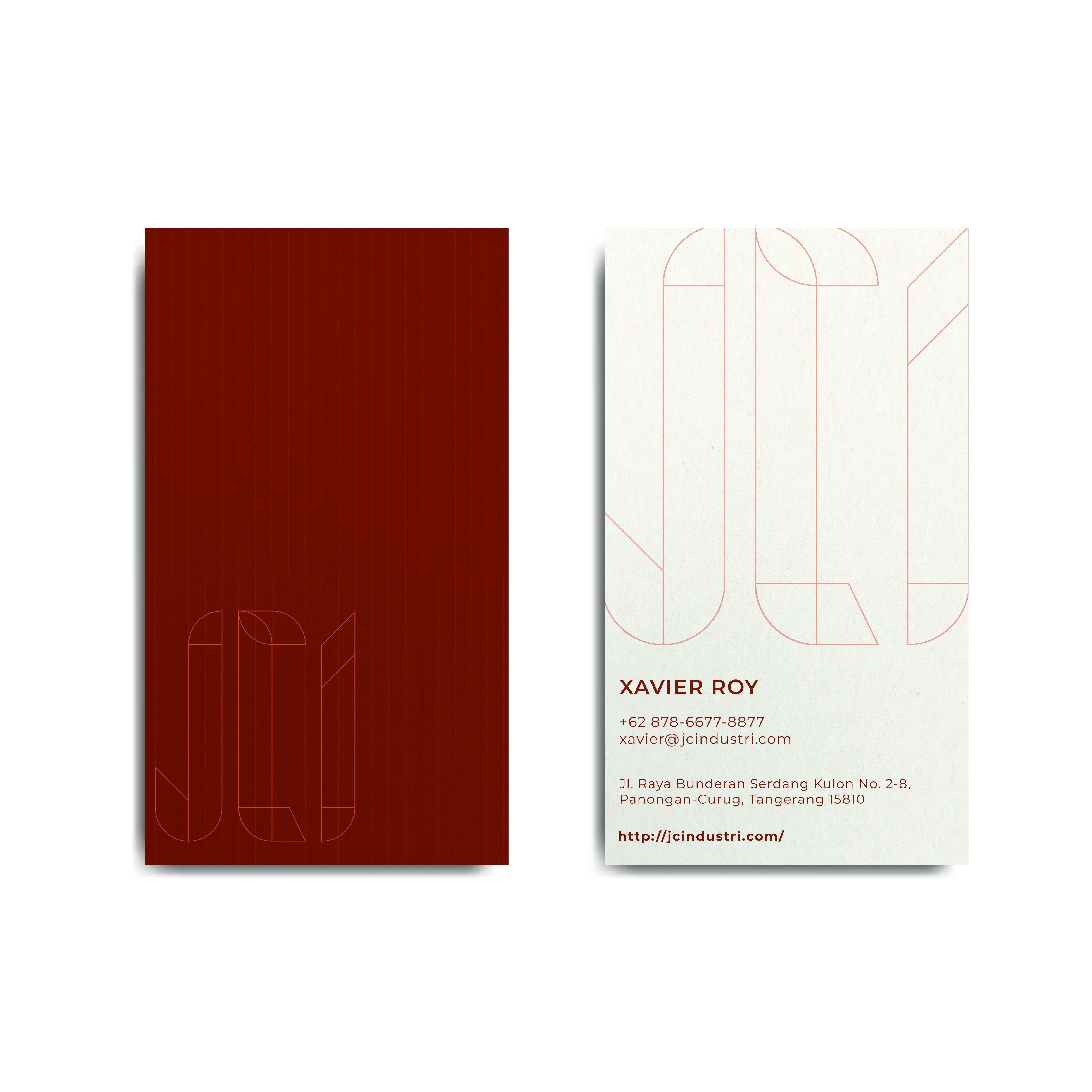
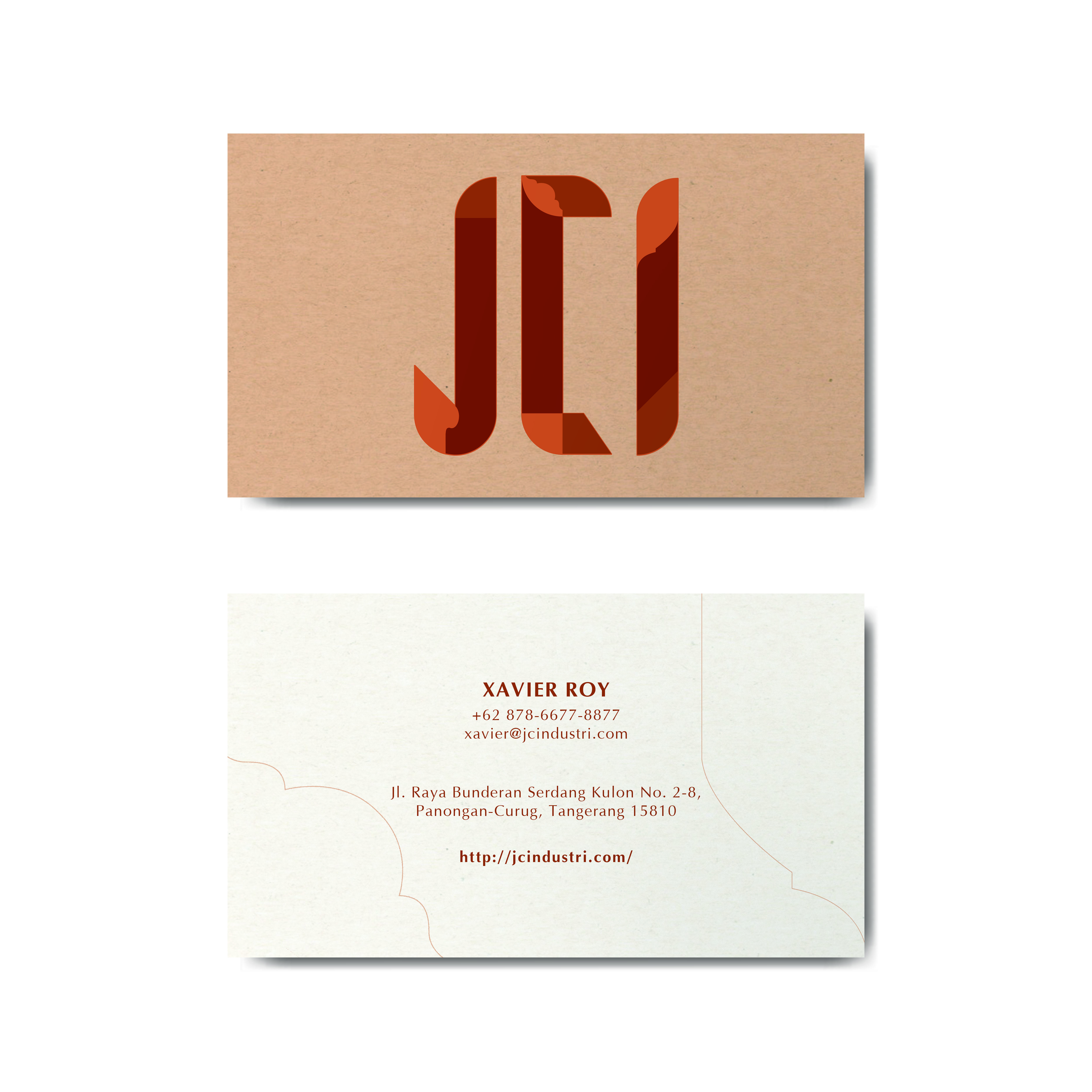
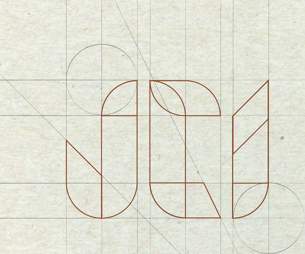
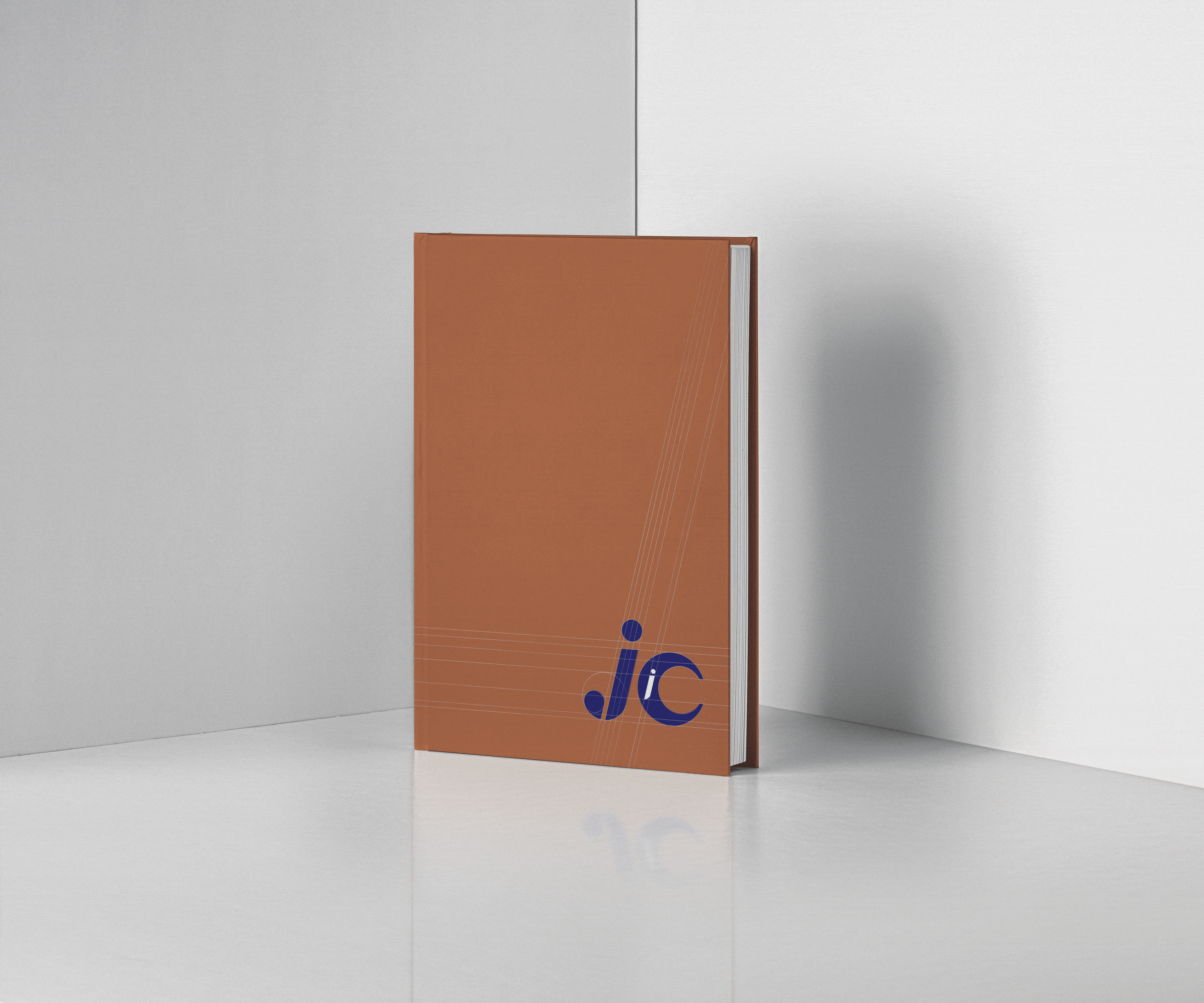
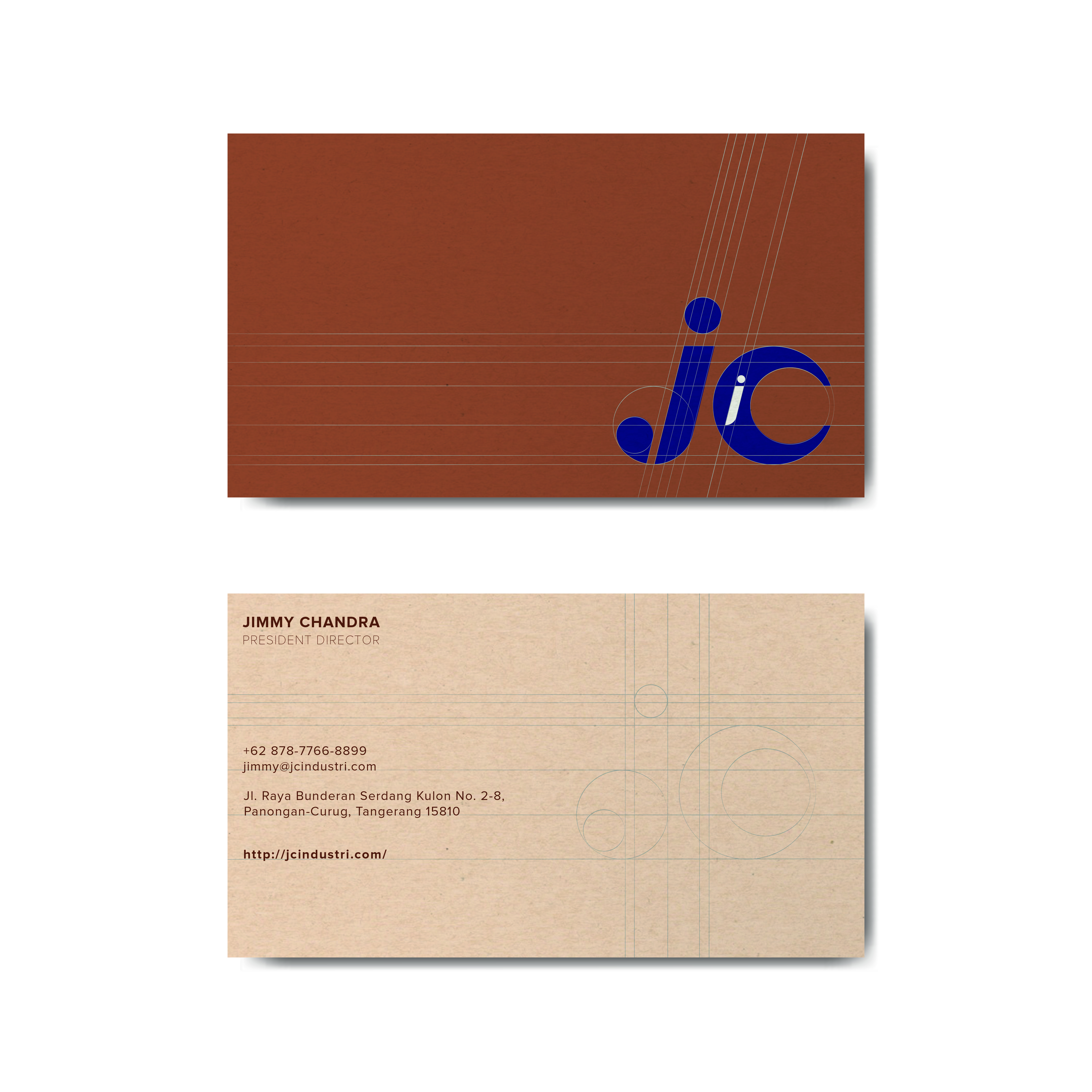
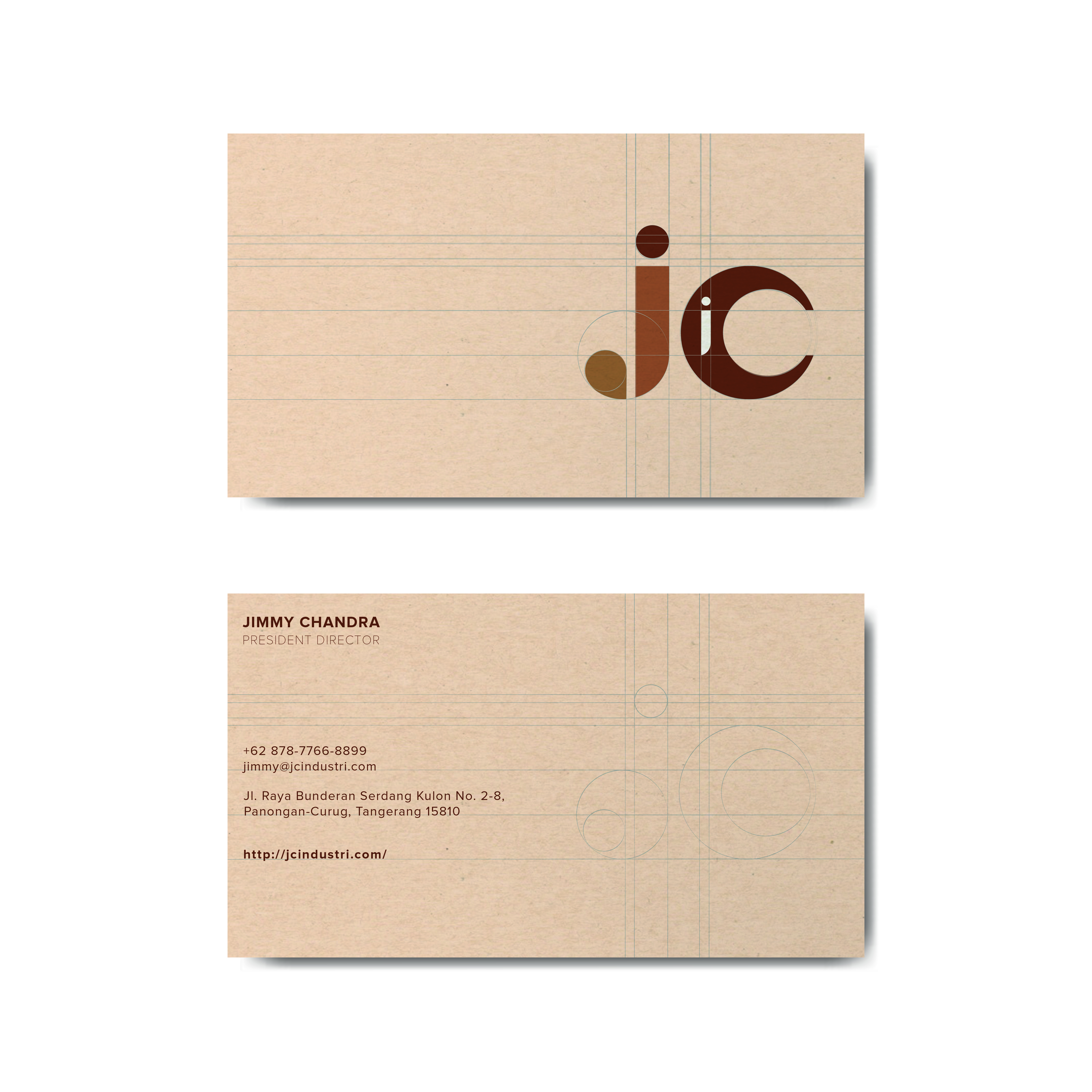
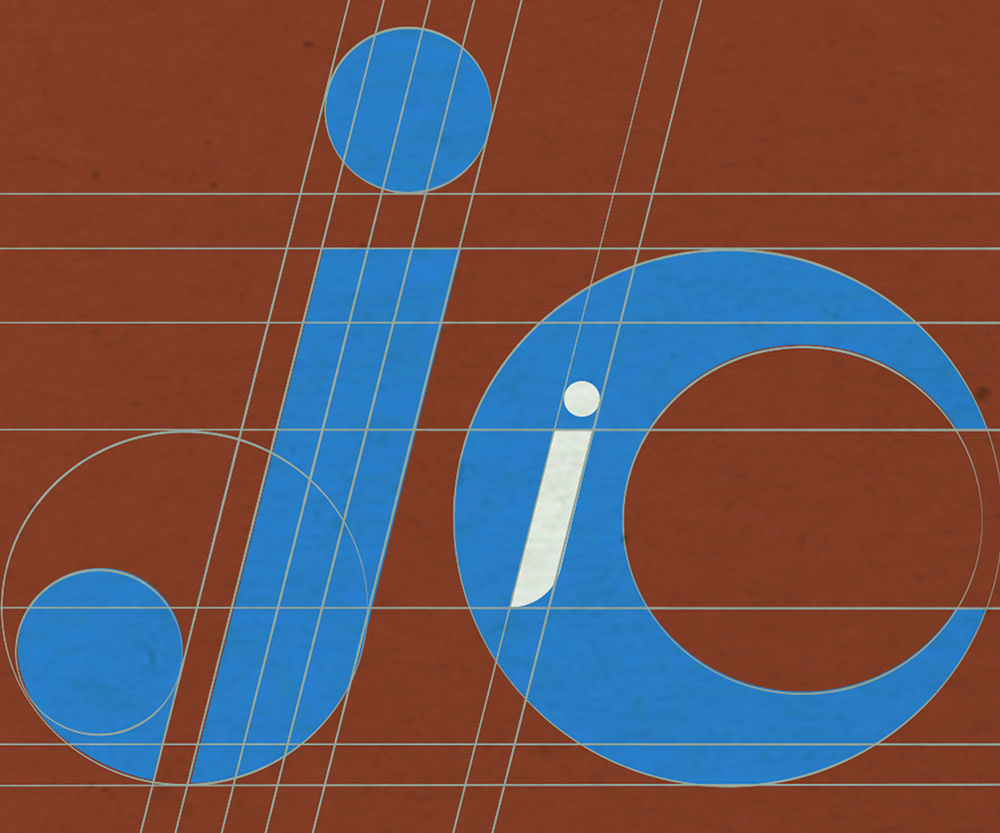
4. Last but not least, there was also an attempt at revitalising the current logo of JCI- the iconic blue emblem that has represented the company for 30 years. This is done by using the logo as the base and constructing a geometric grid to help with the fine-tuning of the visual. 8 different permutations of the logo can be derived from the unique geometric grid. The refreshed logo looks sophisticated, but at the same time still retaining the long-standing legacy of the company.


IN DEPTH